EGN+ has moved to: !eurographicnovels@piefed.social

1264 readers
2 users here now

“BD” refers to Franco-Belgian comics, but let's open things up to include ALL Euro comics and GN's. Euro-style artistry from around the world is also welcome. ^^

* BD = "Bandes dessinées"
* BDT = Bedetheque
* GN = graphic novel
* LBK = Lambiek
* LC = "Ligne claire"

Please DO: 1) follow good 'netiquette' and 2) the four simple rules of lemm.ee (this instance) when posting and commenting. As for extracts, they're fine, but don't link to pirated downloads. Moderation will be based on readers' willingness to follow the above guidelines.

The designated language here is English, with a traditional bias towards French, followed by other Euro languages.

When posting foreign-language content, please DO include helpful context for English-speakers.

---> Here's the community F.A.Q, and our resource page <---

RELATED COMMUNITIES:

SEARCHES:
# #MAILBOX #Tintin #Asterix #LuckyLuke #Spirou #Gaston #CortoMaltese #Thorgal #Sillage(Wake) #Smurfs #Trondheim #Moebius #Jodorowsky

founded 2 years ago
MODERATORS
351
40
submitted 2 years ago* (last edited 2 years ago) by Nacktmull@lemm.ee to c/eurographicnovels@lemm.ee


Moebius: This drawing is one of my earlier experiments with the airbrush. It is also very telling about my spiritual situation at the time. It's not unlike a psychic self-portrait. This was a time of changes, when I decided to completely change my life-style. I quit smoking, stopped drinking, etc.

At the time, I didn't think about it, but today, I see quite clearly a relationship between those weird creatures at the bottom of the picture that are trying to attack the central character and all the bad habits I was trying to break.

From: The Art of Moebius

Published by Epic Comics. All rights reserved. Copyright 1989 by Byron Preiss Visual Publications, Inc. and Starwatcher Graphics, Inc. All illustrations copyright © their respective copyright holders.

352


After a migration to Hetzner cloud earlier today, lemmee federation issues are fixed and also performance feels much better than before. We are looking forward to see all your future posts, have fun!

353
 
 
354
7
Bob...! (infosec.pub)
submitted 2 years ago* (last edited 3 months ago) by JohnnyEnzyme@lemm.ee to c/eurographicnovels@lemm.ee


No, it's Bob et Bobette (or Suske en Wiske, is it not?) by Willy Vandersteen.
If I understand correctly, he's of Dutch descent, who lived and worked out of Belgique.

In any case, I love this kind of action-packed, early 'Hergé-style' ligne claire.
So funny and cute. <3

Now, if this heavily reminds you of The Misadventures of Jocko, the High-Flying Chimp, with his two little human buddies, well actually he was the star of a slightly different series:

https://www.lambiek.net/artists/h/herge.htm#%3A%7E%3Atext=Herg%C3%A9%2FMoulinsart+2012.-%2CJo%2C+Zette+et+Jocko

355


My server was cranky, it was Christmas, and so on, finally I hope everything is back up to speed!

356


Haha, nah, it's really more like these:


(hmm... metaphor for Snowy- Hergé himself?)


(evil Tintin alert?)


Eureka! I've got... something..?


Meh... so at least it's back to Peru, via fortunato!

357


In fact, this dates from the 1947 magazine, i.e. how Tintin was being published at the time.

Haha, and here's a fun, fan-redraw:
https://i.imgur.com/uRpRRac.jpg

Artist: In The Depths of Solitude, via Tumbler

358
10
submitted 2 years ago* (last edited 2 years ago) by Nacktmull@lemm.ee to c/eurographicnovels@lemm.ee


Lucky Luke is back but Jolly Jumper has retired. The poor lonesome cowboy did the obvious and got himself a steed of steel instead. Fitting to the era it´s of course a brake-less bike with one fixed gear, since free-wheel hubs and gear shifting had not been invented at the time. Considering that Luke had always been a pretty hip guy it makes perfect sense to me. Maybe not every purist´s cup of tea but I (as a bike dude) find it absolutely hilarious! What do you all think? Heresy or logical development of a classic character?

359


Some nice, Christmassy colors there. :-)

360


Mœbius: The inspiration for this drawing came from a painting by Maxfield Parrish, which represented a very beautiful girl reclining on a rock. I did this as a joke but behind the joke is an interesting idea. Maybe the girl is really a monster and we now see her true shape. She cries, because she knows she is alone, and she knows she is a monster ....

Morning (1921) by Maxfield Parrish. Cover For Life Magazine, April 6, 1922

Screaming Monster (1974) by Mœbius. Cover for Metal Hurlant, very first issue and Heavy Metal, May, 1977

361
31
submitted 2 years ago* (last edited 3 months ago) by JohnnyEnzyme@lemm.ee to c/eurographicnovels@lemm.ee


Hang on tight!!

362


Swarte has always been someone who tickled me, with his beautifully clean, mad, pleasing designs. For now, this will have to serve as a minor introduction to his work.

Joost Swarte is a Dutch graphic designer, illustrator and architect, and one of the most famous Dutch comic artists internationally, even though he has not made that many actual comics. Most of his better known series, like Jopo de Pojo, Anton Makassar and Katoen en Pinbal (1972-1979), were made in the 1970s. Afterwards he became far better known as an illustrator and architect.

Swarte is not just a follower of the "Clear Line" tradition of Hergé and Edgar P. Jacobs, but is actually the very person who coined and popularised the phrase "Ligne Claire".

!!

Swarte draws in a very calculated, technically-precise style with much attention to bright colours and elegant design work. Swarte is additionally (co-)initiator of magazines Modern Papier and Scratches, as well as the festival Stripdagen Haarlem, and the Hergé Museum in Louvain-La-Neuve, Belgium.

--Lambiek, with edits & additions by Johnny

More here, with samples: https://www.lambiek.net/artists/s/swarte1.htm

363


Took me a while, but I finally got it!
It's an homage to Luncheon of the Boating Party by Renoir, to the left.

No idea what album this is from, I'm afraid. Anybody know..?

364
365


Hey folks-- I'm not feeling too well these days, so I wanted to release some of my notes & scans, just in case.

In this case, there was a fully-constructed page from Tintin and the Picaros, but it got cut for space considerations, as sometimes happens. What's particularly amazing in this case is that George Remi himself (Hergé), took the interviewer step-by-step through the process, in a commentary / supplementary book "Musée."

So I've been working on notes & translations from that book, and it's indeed pretty fascinating, but life is life. Let me just give you the full scans, if you're interested:

https://imgur.com/gallery/ANex7EE

366
 
 
367
 
 
368
11
submitted 2 years ago* (last edited 2 years ago) by Nacktmull@lemm.ee to c/eurographicnovels@lemm.ee
 
 
369


Sorry folks, I'm not feeling that well (multiple health issues).

I'm really happy how this sub / community has come so far, much of the posts being aided and abetted by those of @Nacktmull@lemm.ee and @Loulou@lemmy.mindoki.com.

If you don't mind, for the time-being, I'll just come in once in a while with a fresh post.

370


It started when I sneaked into the adult comic department of my local library, in the early nineties and (much too early for my twelve year old mind) read the works of Matthias Schultheiss for the first time. His drawing and his colouring has always stood out to me and for good reason. He is respected as one of the biggest german comic artists, especially for his releases during the eighties.

Today I would like to give you a little peek into his most renowned series, The Sharks of Lagos. The story revolves around the adventures and struggles of main character Patrick Lambert, a former sailor who turned into a pirate. The modern piracy scenario is depicted with painful realism, which I was unaware of as a kid. In fact, twelve year old me thought it was hyperbolic to the extreme. Well, adult me knows that I could not have been more wrong. If you are unfamiliar with nowadays piracy and it´s social and political background, I very much recommend watching this unusually well done documentary (Englisch) on the topic:

https://www.youtube.com/watch?v=pfanBWX3Fwg

After watching it you will see that in fact nothing in the comics is too exaggerated, at least in the first cycle of the story. Let´s start with the cover art of the series:

First cycle, published 1987-1990:

Second cycle, published 2014-2020:

As you can see, Schultheiss took quite a long pause between the cycles. The success of the first cycle of The Sharks of Lagos and also of The Truth about Shelby caused his subsequent breakthrough as a comic artist, which culminated in him -as the first german comic artist ever- getting his own exhibition, at the 1992 comic festival in Angoulême.

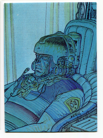
Fueled by success, Schultheiss then went on and attempted to conquer the US and the Japanese markets. Therefore he developed his version of an american super hero series called Propellerman and a manga series called In the Center of Madness. Both flopped on the targeted markets. Disappointed, he turned away from comics and became a writer of scripts for TV shows and children books.

It took fifteen years until he tried again and had a successful comeback with Woman On The River and Daddy, leading to the continuation of The Sharks of Lagos, after his former publisher Splitter approached him and asked if he might want to go on with the series.

Naturally the visual styles of the two cycles are different from each other after such a long temporal gap. It starts with the technique, the first cycle was done in the old school analog style of the eighties, while when doing the second cycle Schultheiss had already switched to working digitally. It goes on with the layout, which is quite traditional in the first cycle but has the panels liberally distributed all over the place in the second, whenever it fits the plot.

The writing style also changed. The first cycle was already full of brutal violence, rape and cruelty but always in ways to be expected from a realistic modern piracy scenario. In the second cycle the violence has a somehow sadistic look to me in the way it is presented and also seems to be more of a tool to illustrate Lambert´s transition from a badass pirate into a comicesque supervillain but enough of the spoilers, let´s get to the samples:

First cycle:

Voodoo Tricks

Survival

Mass Execution

Second cycle

Defying the Elements

Phở

Boarding Party

371
 
 
372
26
François Bourgeon (infosec.pub)
submitted 2 years ago* (last edited 3 months ago) by JohnnyEnzyme@lemm.ee to c/eurographicnovels@lemm.ee


As I see it, he's a great, prolific artist, seen above with Le Cycle de Cyann.

https://www.lambiek.net/artists/b/bourgeon.htm

373


This is easily one of the greatest graphic novel series (3 tomes) I've ever read. It's by Lewis Trondheim, creator of the brilliant Donjon mega-series, plus Ralph Azham, McConey / Lapine, and countless others.

FIRST THOUGHTS: Maggy initially struck me as a likeable 'Bridget Jones'-type youngish woman, in many ways charmingly trying to figure out how best to apply her canny bag of talents to modern life. A talented ingenue, as it were? But good gracious-- the series is so much more than just that.

Our story begins with Maggy freshly hired, yet due to unexpected events, she swiftly goes from 'boring part-time secretary serving a boring PI' (i.e. a dick, a detective), all the way to finding herself deeply embroiled in a painful lottery-ticket-gone-wrong web of murder.

Who is Maggy, anyway? She's young, but canny, resourceful, cynically humorous. She's bold as brass, on the verge of going DOWN.. or NOT, really?

In strolls a new character:

Now we got two. Let's DO this.

Time to get these barstids!

Yeap... bit of an old spoiler, dammit.

Protect yourself, sure... unless someone 'protects themselves even better!'

Any last thoughts, my friend..?

For me, Maggy's such a fun, revelatory, multi-dimensional character, the likes of which we rarely ever see. And especially as a female character! I must say I'm deeply proud of Trondheim for realising this nuanced, realistic series... deeply-satisfying as it is.

CONCLUSIONS? This is an absolute masterclass of a 3-book crime-off-the-rails series. Please check it out if you can. And personally? What particularly impresses me is Trondheim's typically 'light-hearted touch' upon every component, from story to art. It is a level of 'loose mastery' I'm not sure I've ever seen before across comics.

374
15
submitted 2 years ago* (last edited 3 months ago) by JohnnyEnzyme@lemm.ee to c/eurographicnovels@lemm.ee


Note: the idea of this blog / site / subr / community is to welcome a pleasant diversity of talents upon a 'Euro-style' expression of artistry and comics, specifically.

Now, here-- Riad Sattouf (creator of "The Arab of the Future"), little blond kid, is back in Syria, early 80's, I think it was?

375


The first Moebius pic I've ever posted here, haha.

view more: ‹ prev next ›