WolfgangsChannel also recently said he used a comics sans-lile font
this post was submitted on 13 Jun 2023
493 points (100.0% liked)
Programming
14465 readers
3 users here now
All things programming and coding related. Subcommunity of Technology.
This community's icon was made by Aaron Schneider, under the CC-BY-NC-SA 4.0 license.
founded 2 years ago
MODERATORS
Look what you have done! I used Operator Mono for Italics. I kind of like this!
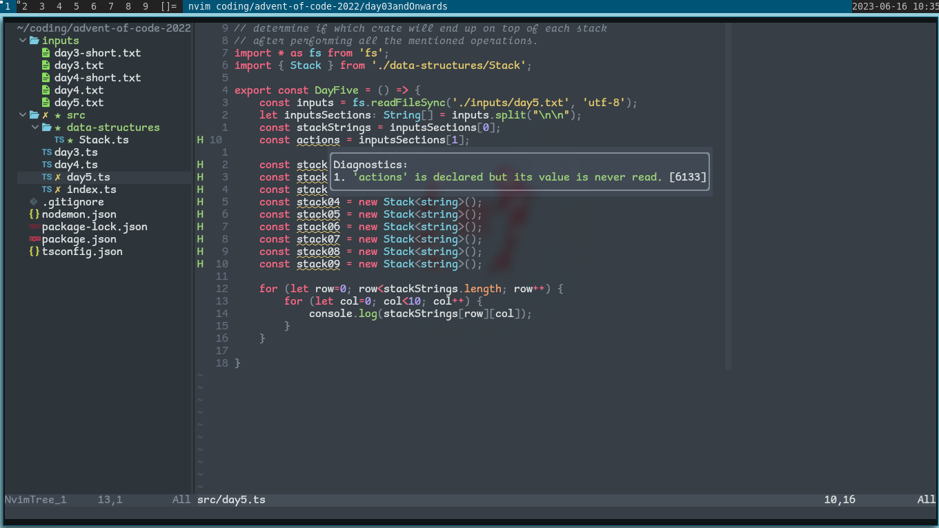
bro... how did you manage to stain a screenshot
Is it that bad? Now I have IBM Plex installed
Stumbled into this site while looking through other comments and apparently it was designed for the speech bubbles of a cartoon dog, not sure about the "legible at small sizes" claim - http://www.connare.com/whycomic.htm
It's actually very common font for dyslexia
I'm intrigued, but it feels so wrong
nice, i’ve been using Comic Code for a couple years now which is similar
load more comments
(1 replies)
I’m intrigued, but it feels so wrong
I am in the same boat. Installing...Dog help me.
You are not alone! ~back in the 90s~ I'd switch mIRC from the default font to Comic Sans for this very reason.
not a crime. i use it for my notepad, it looks weird but its fine for me.
You absolute madman
My eyes just can't adjust to this.
Might have to learn to code, love me some Comic sans
Me too man! Been using it for over a year now, coming from Fira Code. It's actually a real enjoyable font to look at.
It's not even monospace
I was addicted to coding with Comic Mono and ended up purchasing Comic Code. No regrets.
Whatever helps you to the path of a 10x developer, my friend.
Wow, that's kind of amazing. I'll be trying it out now. Thanks!