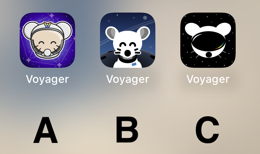
I really like A, feels very professional
Voyager
The official lemmy community for Voyager, an open source, mobile-first client for lemmy.
Rules
- Be nice.
- lemmy.world instance policy
Sponsor development! 👇
💙
Why I chose "B": It's clean and professional-looking. "A" looks a bit complex in comparison, and "C" doesn't look much like a lemming.
I like A a lot, reminds me of the early iPhone days of tasteful skeumorphism.
B is probably my favorite tho -- definitely the cleanest.
C looks off to me, something about the goggles.
B looks best for me
I really like B!
A looks like something an elementary school aged kid would have on their iPad for help learning to add.
B's got my vote.
I vote B.
I like Option B the most
C
B
C
I'd go with A! I like the presentation of B better but the little guy reminds me of Chuck E. Cheese or fnaf. Character in A is adorable :)
I liked C too but it kinda looks like the Reddit guy in VR goggles.
Voted for A, it’s definitely the cutest and I like the rainbow “V”. B has a nice background, though. C I think could do with better defining the shape of the head to look more like a helmet and less like a mouse wearing a VR headset :) Great job to all the applicants!
A or C
I want them all! They all look fabulous!
Loving the C image design, it looks great
A
I Vote for A. It pops out a bit. But then again it's my most used app. But B Also works. C is a bit unpolished IMHO.
C
C
I like C.
Initially I liked the background on A and the lemmy on B....
....but I think C has my vote just for the sheer symbolism it projects - a confident lemmy ready to boldly venture into the future fediverse.
A
🅱️
B gang
Definitely B
I made a shortcut that lets you change web app icons on iOS, so if you either want to try out the icons or actually use a different icon (maybe one of the other great ones that haven’t made it to the final vote). Here it is: Shortcut link
B, but the planet in the background makes it look like extremely large shoulders.
C Simple and cool but gets the point across.
Middle B. SOOOO cute! Good definition and simpler than the others. Good contrast between foreground and background. Great little icon!
I vote for A
B
No matter which all three are solid!
B
obviously B
A
Current is best or B
I was hoping for a more rainbow theme! This will be a tough decision.
One vote for C
C, but it needs the eyes to be cute'r
C
A or C
Voting for A
They are pretty nice but I like A or the current one.


