this post was submitted on 25 May 2024
50 points (98.1% liked)

covid

795 readers
2 users here now

Try to include sources for posts

No Covid misinformation, including anti-vaxx, anti-mask, anti-lockdown takes.

COVID MINIMIZATION = BAN

This community is a safe space for COVID-related discussion. People who minimize/deny COVID, are anti-mask, etc... will be banned.

Off-topic posts will be removed

Jessica Wildfire's COVID bookmark list

Covid.Tips

COVID-safe dentists: (thanks sovietknuckles)

New wastewater tracking (replacing biobot): https://data.wastewaterscan.org/tracker

founded 3 years ago
MODERATORS
 

NGL, it wasn't much data anymore with how little monitoring is happening in florida, but it's still just about all that was reliable.

https://twitter.com/BiobotAnalytics/status/1791944840789291116

People are leaving replies asking them to reconsider. Hopefully they do.

top 11 comments
sorted by: hot top controversial new old
[–] sovietknuckles@hexbear.net 12 points 1 year ago

The CDC's Wastewater Surveillance dashboard can answer simple questions like whether whether line go up nationally or in specific counties, but some graphs don't have direct replacements. The year-over-year dashboard could not predict future spikes, but it was helpful predicting rate of decline:

Year-over-year chart

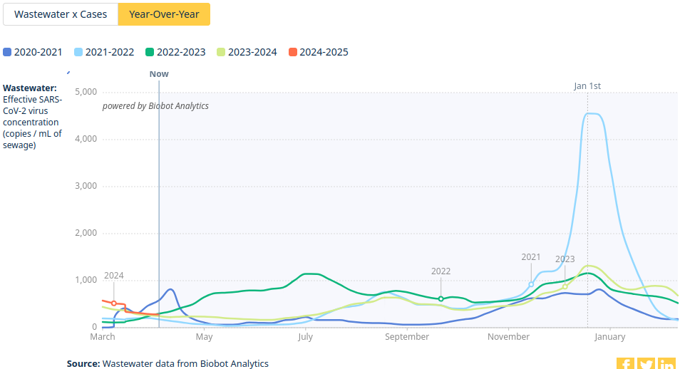
That one can be remade using existing data, though it lacks variant data.

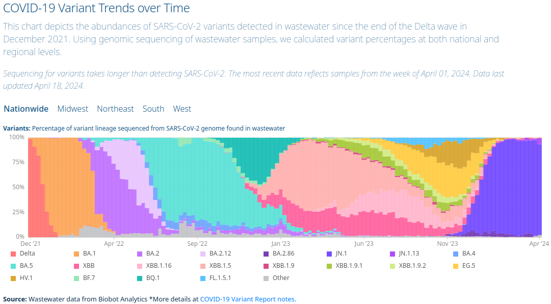
The one that I paid more attention to was the COVID-19 Variant Trends over Time chart, which illustrates transmission advantage of different variants by how quickly they become dominant:

COVID variants dashboard

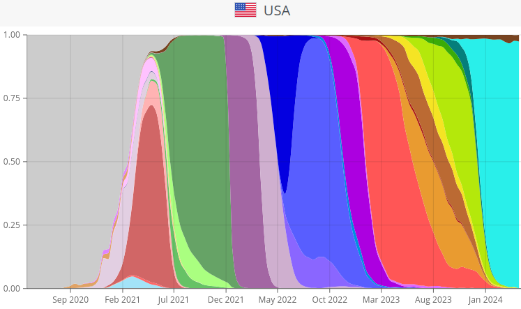
CoVariants.org maybe has a comparable chart (It doesn't show KP.2 yet, but neither did Biobot). Unlike Biobot, they have variant charts for other countries and individual US states.

CoVariants.org US chart

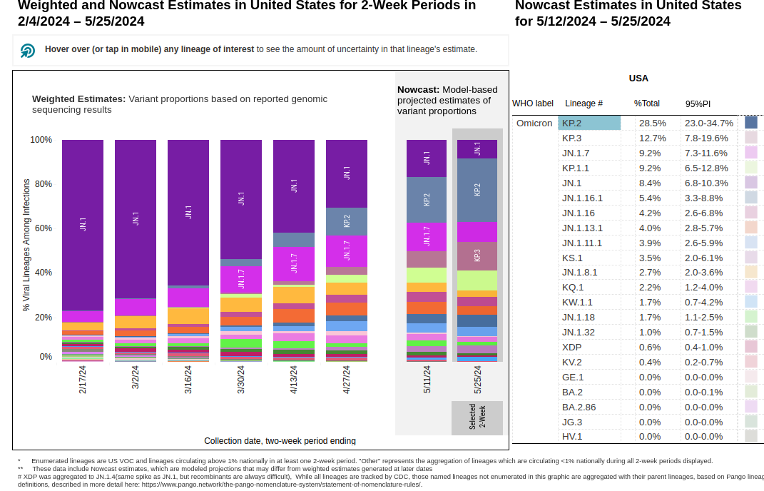
The CDC's 2-week variant chart does include KP.2/KP.3, but because it doesn't group sublineages like Biobot did, it might not not be as coherent over a larger period than 2 weeks.

CDC 2-week variant chart

[–] barrbaric@hexbear.net 11 points 1 year ago (1 children)

Stuff like this shutting down is always awful. As time goes on, there will be less and less evidence to point normies to as an explanation for why COVID is still real, and all of us will seem just that little bit crazier to them.

[–] JoeByeThen@hexbear.net 8 points 1 year ago

I don't think data is what's gonna convince people anymore, tbh. There are some people out there who simply respond to authority "figures" whether that be presidents or news sources.

But actual wastewater data, as opposed to the cdc's kinda useless map, is one of the few points of data that gave me an idea of what's going on. Now we basically gotta go by vibes.

[–] sovietknuckles@hexbear.net 9 points 1 year ago* (last edited 1 year ago) (1 children)

People are leaving replies asking them to reconsider. Hopefully they do.

It's not that they wanted to shut it down. The CDC ended their contract with Biobot in September 2023 in favor of Verily, and Biobot filed an appeal. If Biobot is now sunsetting their wastewater dashboard, they must have lost the appeal.

[–] JoeByeThen@hexbear.net 4 points 1 year ago (1 children)

I'm not sure that's the case, as they are still doing summary reports of the collected data.

https://biobot.io/risk-reports/covid-19-influenza-and-rsv-wastewater-monitoring-in-the-u-s-week-of-may-20-2024/

I do wonder if it's that so many counties have stopped participating that they were starting to look silly. Florida was down to 3 or 4 out 67 counties. Looking at all the state date was looking like a graph graveyard.

[–] sovietknuckles@hexbear.net 3 points 1 year ago* (last edited 1 year ago) (1 children)

I do wonder if it's that so many counties have stopped participating that they were starting to look silly. Florida was down to 3 or 4 out 67 counties. Looking at all the state date was looking like a graph graveyard.

WastewaterSCAN, the partner of Verily, the company the CDC chose over Biobot for dirt cheap, has you covered. Their chart includes 13 utilities in Florida:

confusing chart

Their All Wastewater Sites chart includes data from 194 sites, 1 line per site:

even more confusing chart

[–] JoeByeThen@hexbear.net 2 points 1 year ago

Their chart includes 13 utilities in Florida:

Woo! We're up to 5 or 6 counties now! lmao, the bar has been raised! data-laughing 
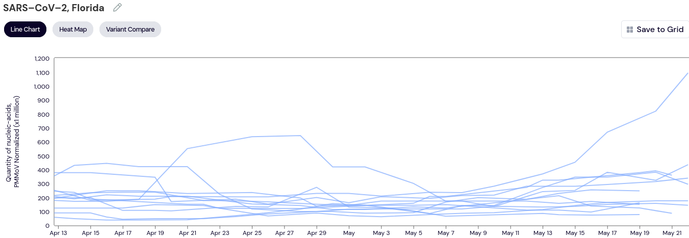
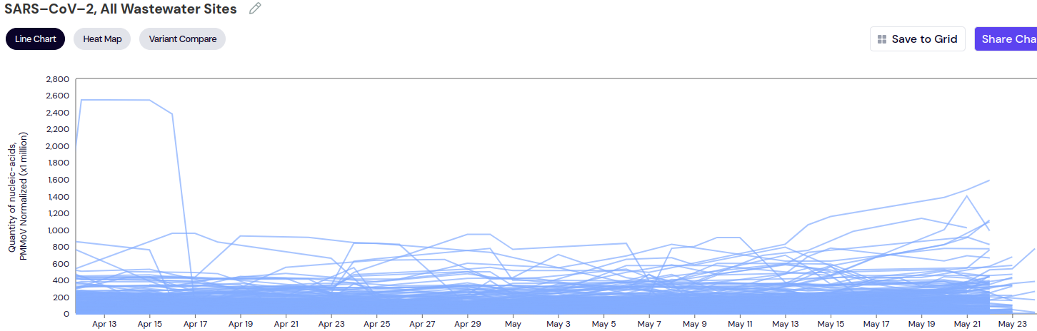
Thanks for pointing me towards this. Should at least fulfill the role biobot's graphs were in giving me an idea of when we're in the middle of a statewide wave. Looks like things are starting to pick up again down in St Pete. doomer

[–] Barx@hexbear.net 4 points 1 year ago (1 children)

Sites like biobot were basically the only way I'd ever consider unmasking in the future - sustained low levels for months at a time with graphs I could check every week to decide whether I need to mask again.

Without these tools I'll need to either hope there are summaries of some kind published every so often or just give up and assume I'll need to hold out for like a decade or something.

[–] JoeByeThen@hexbear.net 6 points 1 year ago (1 children)

Totally there with ya. Check the site @sovietknuckles@hexbear.net shared. Seems like it may be a little bit better than biobot as far as coverage, just not as much info for variants, maybe.

https://data.wastewaterscan.org/tracker/