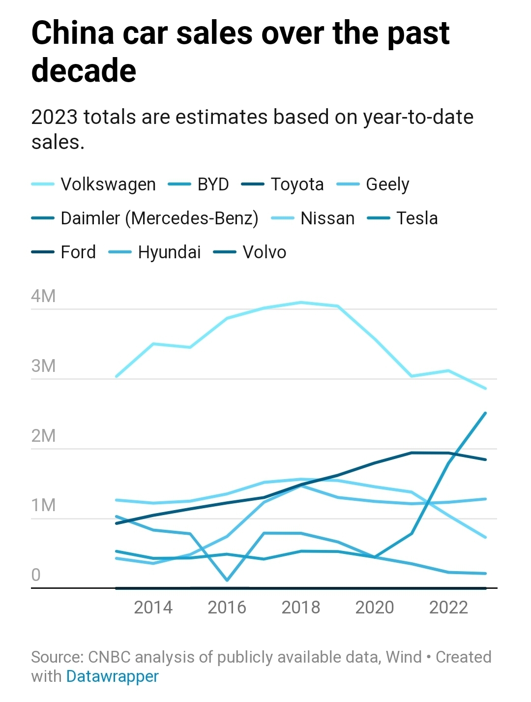
One of the worst color schemes I've ever seen in a chart. At least it's interactive.
We have moved to:
Archive
A community for the sharing of links, news, and discussion related to Electric Vehicles.
One of the worst color schemes I've ever seen in a chart. At least it's interactive.
Finally a diagram that is inclusive for the colorblind, by being equally bad for everyone.
Maybe they were colorblind lol
Oh my god this is bad lol
So bad it might fit in on dataisbeautiful
Legend has ten entries, all blue. Graph only shows six lines of data. This monstrosity would fit perfectly there.
it matches CNBC's reporting. All coming from the people they trust, the sponsors.
Even in the West, "fueling" an electric vehicle is cheaper than fueling a gas guzzler. Especially if you have a solar array at home.
And then there's China and India where electricity is already 1/3 to 1/8th the cost of most of the West.
As we say in Germany: "Tja."
Machste nix.
Konnte überhaupt keiner kommen sehen.