Hi!
I've (already) opened the issue on GitHub and that can/should be kept for the final technical specs.
https://github.com/dessalines/thumb-key/issues/602
I'd like to open the thread here to work out and discuss any details.
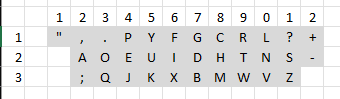
The layout would use the full width and is suited for two-hand typing:

Some of my immediate questions would be:
- Does this fit the idea behind the ThumbKey app? It is for thumb typing, after all.
- How to get a good layout? The hype is on AI but people have been doing this through trial and error for a while now.