A mallard duck, leering at me.
Vexillology
A community dedicated to flags and discussion about flags.
Other communities:
- Vexillologyjerk /c/vexillologyjerk@lemmy.antemeridiem.xyz
Quick tweak
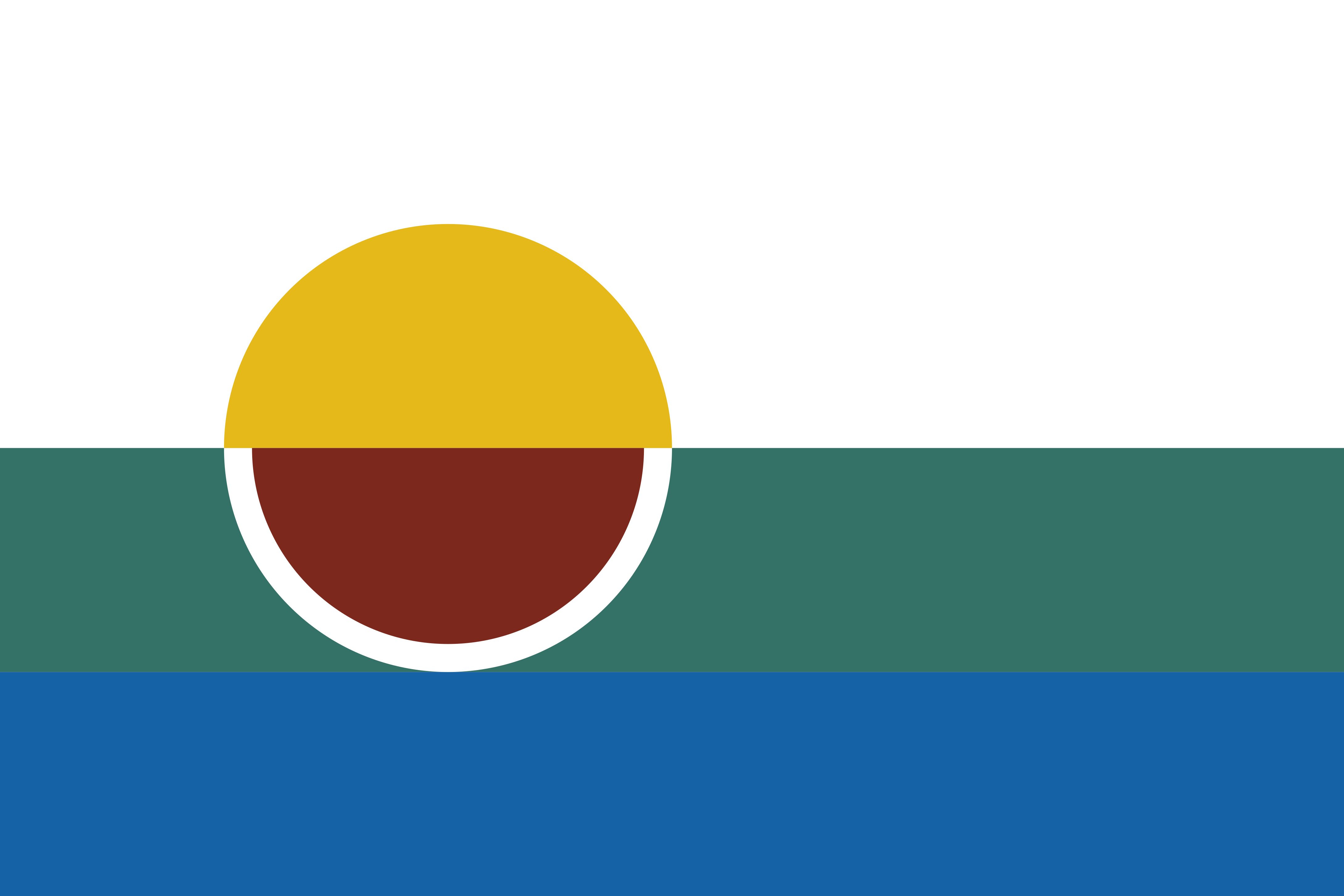
Green and blue are pretty close to each other on the color spectrum, and they blend together at a distance. I would simplify and remove either the land or the water. They won’t blend into each other, and you still have more than enough symbolism.
The stoke on the wine glass is super smart. I like it. But I agree with the other commenter who recommended unifying the semi circle fill sizes. It simplifies the layout.
I would also pump up the stroke on the wine glass so that is reads a bit better from a distance. Also, that stroke is clever, so play that element up.

I'll miss the land or water if I have to choose one... Maybe some ambiguous teal to be both? Or I could do a much darker green against a lighter blue.
Definitely gonna apply all your other suggestions.
