@Deceptichum@quokk.au has 10 votes now. So I think he wins!
cloudless
joined 2 years ago
Thanks. Enjoy the ride!

I don’t remember but chatgpt does:
You’re not misremembering at all — Blade Runner (1982) definitely includes Art Nouveau influences, though it’s more subtle and mixed in with other architectural styles, especially Art Deco, futurist cyberpunk, and brutalism.
The most prominent example of Art Nouveau is Sebastian’s apartment, with its ornate interiors, curving lines, and whimsical, decorative elements. You can also see flourishes of it in some of the neon signage, detailing in the buildings, and the organic-mechanical fusion that defines the film’s aesthetic. Director Ridley Scott and the design team drew on a wide range of architectural and visual influences to create that dense, layered urban landscape — Art Nouveau was definitely part of that visual stew.

This is what the Sylvanian Families Movie should have been.
"We have QR code at home"
Which part doesn't make sense?
Cats working at Dunder Meowfflin.

Yay! Ukraine gets Crimea back.
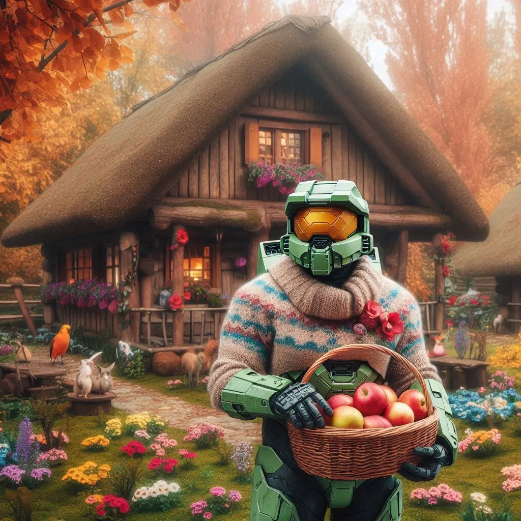
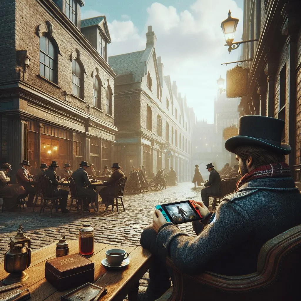
This really looks feasible and marketable as an actual product. I wonder how much of product design/prototype is being done using AI now.
[ Community Challenge 72 ] Duotone
Theme
Duotone refers to a method of creating images or prints using two contrasting colors or tones. This technique is often used in photography and design to enhance the visual appeal of an image by applying two distinct colors to different parts of the image, such as highlights and shadows. Traditionally, duotones were created by overprinting two halftone screens, one typically black and the other a contrasting color like blue, yellow, or red.
In modern design, duotones are used to create visually striking effects by limiting the color palette to two contrasting colors. This can make images stand out, especially in backgrounds or as focal points in design projects. Duotones can also be used to evoke a specific mood or aesthetic, such as a vintage look with sepia tones.
Any subject/theme is welcome, as long as duotone is applied.
Voting process
Everyone can submit their image to this post. At the end of the week all images will be collected and shared in a new voting post wherein people can vote on their favorite image. This will be up for at least 24 hours before a winner is made.
There are no extra points to be earned, OP will decide on a winner in case of a tie.
Rules
- Follow the community’s rules above all else
- One comment and image per user
- Embed image directly in the post (no external link)
- Workflow/Prompt sharing encouraged but not required (we’re all here for fun and learning)
- Down votes will not be counted
- Voting and final scoring will be done in a separate post.
Scores
At the end of the challenge the image with the most votes, wins! It’s that simple :)
The winner gets to pick the next theme. As always, have fun everyone!

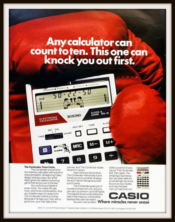
Read about the real one:
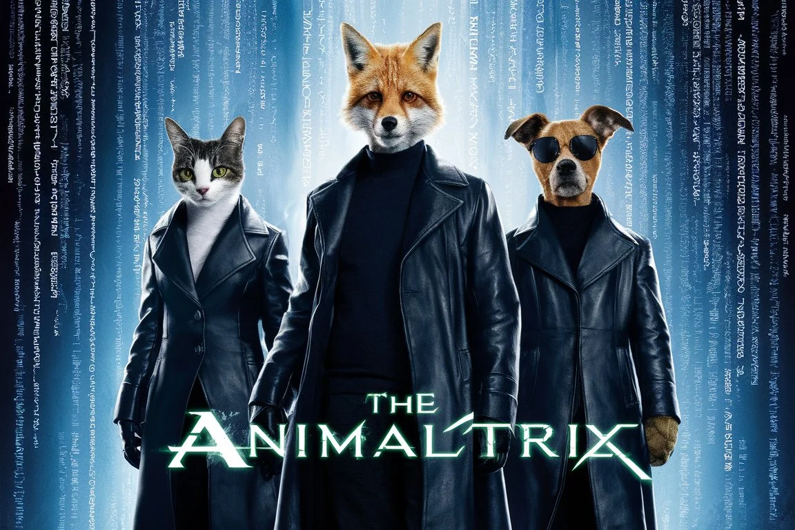
Inspired by The Animatrix
view more: next ›
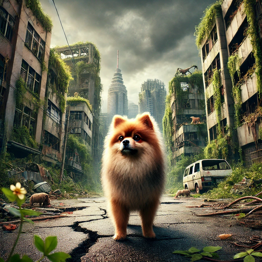
The dinosaurs are paid actors!