The one that always gets me is GNOME's screen sharing portal.
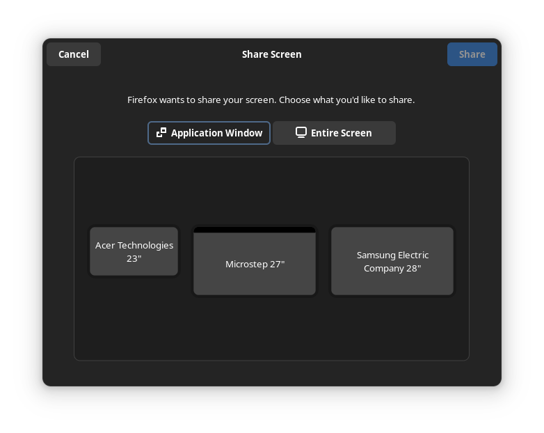
There is this outline around the "Application Window" tab which makes it seem selected. I use this UI multiple times a week and I need to pause for a sec every single time. I always think "I want to share a window", "oh it is already selected" then stare at the monitors for a while before I realize why I can't understand what I am looking at.
I don't think it is that simple. I think that outline is about the "focus". So if I press enter it will activate that tab, if I press tab it will move the focus to the "Entire Screen" tab.
The UX issue is that there are two concepts of focus in this UI. There is "which tab is active" and "what UI element will pressing enter activate". These two are not sufficiently differentiated which leads to a confusing experience.
Or maybe there can just be no keyboard focus indicator by default, but that may be annoying for keyboard power users. But this is generally how it works on the web, you have to press tab once to move keyboard focus to the first interactive element.