Great find, most egregious one I've ever seen!
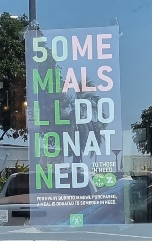
Images of text-designs, that are barely readable due to the placement of the words or letters
Please indicate which post is original by writing "OC" and properly credit stolen posts.
Please mark NSFW posts properly, don't spam, yadadadada
Great find, most egregious one I've ever seen!
Yeah i drove past it and it hurt my brain
I can imagine! I can't see it being effective unless just from notoriety.
50 me mials'll do. Ionated
50 millennials… some do… I’ll do… nato?
I’m still struggling to figure out what it says.
To those in need
some mials'll do ion at ned. to those in need.
We've all done ion at Ned's
It's the graphic design equivalent of click bait. Save yourself from bad design and commercial programming, ignore this crap.
“We need to spell ‘millions’ but we don’t have enough room on the sign and hyphenating it will look bad. What do we do?”
“Make it worse.”
Why do they call it oven when you of in the cold food of out the hot eat the food?
!ihadastroke@lemm.ee

This fills me with rage. I feel a strong urge to seek out every physical and digital copy of this thing and erase it from existence.
Well be cracking Enigma by tomorrow boys!
This just hurts
That took me far too long to understand.
And the one near me shut down unfortunately
"50 Million meals donated"
I am far more proud of myself than I should be for figuring that out.
No, I think it's supposed to say "50me mials lldo ionat ned". Surely, if it were supposed to convey any other meaning, they would write it in a way that does so, right?