this post was submitted on 14 Feb 2024
51 points (98.1% liked)

Formula 1

10084 readers
7 users here now

Welcome to Formula1 @ lemmy.world Lemmy's largest community for Formula 1 and related racing series


๐Ÿ“† F1 Calendar
๐Ÿ FIA Documents
๐Ÿ“Š F1 Pace


2025 Calendar

Location Date
๐Ÿ‡จ๐Ÿ‡ฆ Canada 13-15 Jun
๐Ÿ‡ฆ๐Ÿ‡น Austria 27-29 Jun
๐Ÿ‡ฌ๐Ÿ‡ง Great Britain 04-06 Jul
๐Ÿ‡ง๐Ÿ‡ช Belgium 25-27 Jul
๐Ÿ‡ญ๐Ÿ‡บ Hungary 01-03 Aug
๐Ÿ‡ณ๐Ÿ‡ฑ Netherlands 29-31 Aug
๐Ÿ‡ฎ๐Ÿ‡น Italy 05-07 Sep
๐Ÿ‡ฆ๐Ÿ‡ฟ Azerbaijan 19-21 Sep
๐Ÿ‡ธ๐Ÿ‡ฌ Singapore 03-05 Oct
๐Ÿ‡บ๐Ÿ‡ธ United States 17-19 Oct
๐Ÿ‡ฒ๐Ÿ‡ฝ Mexico 24-26 Oct
๐Ÿ‡ง๐Ÿ‡ท Brazil 07-09 Nov
๐Ÿ‡บ๐Ÿ‡ธ United States 20-22 Nov
๐Ÿ‡ถ๐Ÿ‡ฆ Qatar 28-30 Nov
๐Ÿ‡ฆ๐Ÿ‡ช Abu Dhabi 05-07 Dec

Rules


  1. Be respectful to everyone: drivers, lemmings etc
  2. No gambling, crypto or NFTs
  3. Spoilers are allowed
  4. Non English articles should include a translation in the comments by deepl.com or similar
  5. Paywalled articles should include at least a brief summary in the comments, the wording of the article should not be altered
  6. Social media posts should be posted as screenshots with a link for those who want to view it
  7. Memes are allowed on Monday only as we all do like a laugh or 2, but donโ€™t want to become formuladank.
  8. No duplicate posts, or posts of different news companies that say the same thing.

founded 2 years ago
MODERATORS
 
top 16 comments
sorted by: hot top controversial new old
[โ€“] TheGrandNagus@lemmy.world 21 points 1 year ago* (last edited 1 year ago) (2 children)

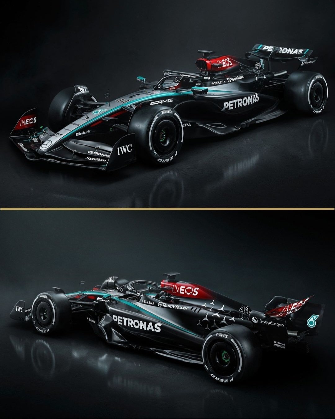
Honestly, of all the cars adding big swathes of black, Merc is the only one it truly suits IMO.

I know they're the "silver arrows", but I've never actually liked the silver livery. I always thought it looked like "we have chrome McLarens at home". So bland.

When they went black I was like god damn that suits them way better, they look mean.

[โ€“] neumast@lemmy.world 8 points 1 year ago (1 children)

The funny thing is: in the old days of F1, Mercedes scratched off the paint for weight reasons, revealing the aluminum beneath. Hence "silver arrows". Today they are doing it for the same reason, only revealing carbon fiber instead of aluminum.

So the black silver arrows?

[โ€“] Coelacanth@feddit.nu 1 points 1 year ago

Aston Martin managed to work with the exposed carbon really well this year too, imo. There is actually quite a bit of it, but thanks to the clever paint job it doesn't look like it. One of my favourites this year, alongside Ferrari of course.

[โ€“] resetbypeer@lemmy.world 11 points 1 year ago

It's going to be wild if Merc gets their shit together and Lewis jumps ship at the wrong time. Time will tell.

[โ€“] highduc@lemmy.ml 7 points 1 year ago (2 children)

Different sidepod intake than what the rest are doing. Also the top of those sidepods looks really flat compared to other cars.
Anyway looks don't matter in the end, performance does. I'm glad they and Ferrari are doing their own thing in certain aspects rather than just copying RB.

[โ€“] bhmnscmm@lemmy.world 2 points 1 year ago

I agree. The sidepod inlet is very unique looking with the fillet feature on the bottom, similar to what I remember on the zero-pod car. The subtle water slide on the top of the sidepod kinda looks like last year's Alpine.

The lack of stays on the floor is another obvious change for them from last year. And I don't remember the big scoop on the tip of the front wing either.

[โ€“] reddit_sux@lemmy.world 2 points 1 year ago

I doubt these would be the sidepods on the cars they will be running in a few days.

[โ€“] Sentau@discuss.tchncs.de 4 points 1 year ago

This looks good and weird at the same time. My brain is very confused

Nice to see them add some silver accent, now wait until we see a real picture and not this digital version.

[โ€“] HerrVorragend@lemmy.world 2 points 1 year ago* (last edited 1 year ago) (1 children)

I like the contrast of silver and black. Looks like a 'best-of' of the recent liveries.

The red Ineos parts are still hideous, though.

[โ€“] Parellius@lemmy.world 2 points 1 year ago

On the plus side it now looks less like a dog's.... Erm.... Lipstick.

[โ€“] lazycouchpotato@lemmy.world 2 points 1 year ago (1 children)

Quite like that teal strip.

[โ€“] highduc@lemmy.ml 0 points 1 year ago (1 children)

Really? I particularly dislike it. I think it's too much, too many colors. And it doesn't work well with the red imo.
Anyway I think I'm in the minority, most comments I've seen are positive towards it.

Yeah that's fine. People liked the VCarb livery, I didn't. Everyone has different tastes.

[โ€“] wes@lemmy.world 2 points 1 year ago

Really like the design, hopefully itโ€™s also fast right away.